What Makes A Good Medical Website Design?
Introduction
If you are in the healthcare industry, you should know just how crucial good medical website design is. It’s not just about looking modern but also about being crafted with both visitors and search engines in mind. In a time of an increased number of healthcare providers, as well as extensive coverage of healthcare insurance policies, patients are often confused and lack a clear opinion on which medical practice to choose.
In that case, they usually turn to the internet and search for healthcare services or illnesses. Consequently, it is not surprising that 75% of U.S. citizens use online sources as their first go-to for health information. Let’s take a look at the specific features your healthcare website should have.
Clean Design
Services landing pages are usually a core part of a medical practice website. They must fulfill several requirements in order to retain visitors and convert them into your clients.
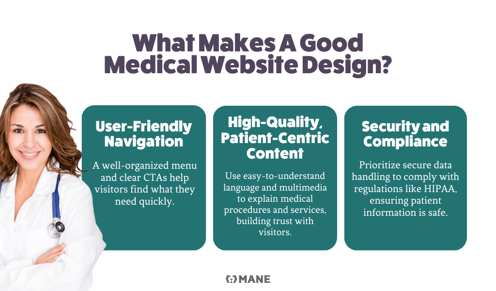
First and foremost, these pages need to have a clean design and intuitive navigation. Easily readable fonts, clear titles that separate paragraphs and sections, and high-resolution images and videos are just a few elements to include.
When speaking specifically about UI design elements, you should include at least some of them, e.g., checkboxes, accordions, CTA buttons, breadcrumbs, sliders, search fields, pagination, and icons.
Straightforward and User-friendly Navigation
Having intuitive navigation that assists visitors in navigating through your website can be paramount for keeping them on the site and fulfilling their search intent. It is crucial to feature the most important services on the website, as well as the ‘About Us’ landing page, the doctors’ team, contact information, and a CTA (Call to Action) button in the main menu. However, having too many pages can be confusing for visitors, so try to strike the right balance when creating a menu.
Also, maintaining a clear footer with links to the main pages, as well as additional ones, can assist in navigating visitors to the landing pages they seek or those that capture their attention.

Prominent Search Bar
A search bar is a component of navigation in web design that helps users find information on the medical practice website quickly. If the search yields accurate results, users may stay on the website for a considerable amount of time.
Patient-Centric Content
Combination and richness of content on them will determine often if a visitor’s intent will be fulfilled on your page. Although some things may seem self-explanatory, it is crucial to pay special attention to them. Having medical services and procedures, illnesses, and other health conditions described concisely, in simple language, and displayed in a visually appealing way can be even more important than the quality of services you provide to patients. Clear explanations of medical procedures, health conditions, and treatment options accompanied by examples, images, videos, and pricing information, without an overload of medical terms, are the foundational content from which you should start.
A Blog Section
A blog section can be a perfect way to bring more visitors to your website. Some percentage of them may not seek services. However, if you design your blog post in a way that contains a section which invites visitors to convert, it will increase the percentage of those who visit your website to make an appointment, sign up for your newsletter, or at least navigate to the service landing page.

Updated Information
Ensuring that information related to your medical institution is up-to-date will make your website reliable for visitors. If they find that the phone number, prices, or information related to medical staff are incorrect, they will lose trust in you, potentially for good.
Mobile-friendly Website
More than 80% of users surf the internet on their mobile devices. A mobile-first approach in website design has already become prevalent. This is also true for healthcare website design, especially considering that many visitors access these websites in either somewhat urgent situations or during periods of relaxation, such as scheduling regular exams or medical consultations related to beautification.
Patients’ Feedback
The Patient Reviews or Testimonials sections are strong social proofs of the quality of services your hospital or other healthcare practice provides. Featuring this kind of content on the home page and services landing pages can help visitors gain confidence in you more easily.
Security Measures
If you collect any kind of patient’s personal data, i.e., date of birth, phone number, email address, SSN, or similar, it is very important to obey rules related to the security of that data (secure the website, protect patient data in accordance with the Health Insurance Portability and Accountability Act (HIPAA), use strong passwords, etc.).
Also, you should ask your website visitors in a transparent way if they agree to you saving their data and inform them about how you will protect it.
Speaking about UX (user experience) security features on the medical practice website, you should:
- Create a popup with which they will have to interact in order to remove it from the screen.
- Make a page with explanations related to the policies (privacy policy, cookies policy, terms and conditions, etc.) you apply on the website.
- Ask visitors to read those policies and give their confirmation.
- Enable visitors to easily delete the data you collected.
E-E-A-T Rules for Credibility and Trust
E-E-A-T is an acronym for Experience, Expertise, Authoritativeness, and Trustworthiness. Although this term is mostly related to SEO and Google’s understanding of a medical website, it can also be applied to visitors and their user experience. In terms of website features, it means:
- Showcasing the medical staff’s qualifications and certifications.
- Making the authors of blog posts transparent, ideally representatives of your institution’s staff.
- Using citations as references to paragraphs of text.
- Demonstrating presence in reputable medical organizations to build trust.
Strong Call-to-Action (CTA)
Keeping conversions in mind leads us to the call-to-action feature. There are a few tactics you can use to increase the percentage of actions fulfilled.
- Use contrasting colors and persuasive language in UI web design to encourage action.
- Make the CTA button in navigation sticky so it is always on the screen during page scrolling.
- On mobile, make the CTA button (e.g., phone number) sticky at the bottom of the screen.
Some different types of CTA features on healthcare websites that can attract leads are:
- Appointment scheduling form,
- Contact forms,
- Phone number calling button,
- Newsletter sign-up.
Without a doubt, medical website design can play a crucial role in positioning your healthcare organization. At MANE Digital, we apply a tailor-made approach, customized to your medical practice’s needs. Our experience in website design and SEO optimization services of medical websites makes us the perfect partner. Explore our previous work to get a glimpse of what we can achieve together, or contact us for collaboration.


