Web Design for Higher Education – 6 Cool Tips You Should Know
Introduction
Higher education institutions will often pay a lot of attention to their appearance offline but ignore the importance of a good college website. While touring universities in person used to be how prospective students familiarized themselves with the school and campus life, this is no longer the case. Instead, university websites are now the front door to learning about the university and getting a digital experience of what their curriculum, studies, and university life will look like. A well-built and easy-to-navigate website design for educational institutions will draw more students is bound to draw more students in and, thus, increase admission rates and school competitiveness.
If you are not sure of where to start with building your higher ed web design or website content to create a college website that will draw more people in, then the following tips are going to help you learn how to best take advantage of the best practices for the design and development of a well-thought-out and engaging website.

What makes a good university website?
Good university websites will, above all else, have website content built to help students understand everything about student life. This will include course structures, module structures, information on the academic stuff, core progression information, and information on the student body and campus life. However, just having this information on hand is not enough. If you want to ensure you will design a website that will inspire your target audience to join your college, you will need to think about the design and development of your website in the following terms:
1. Simplicity
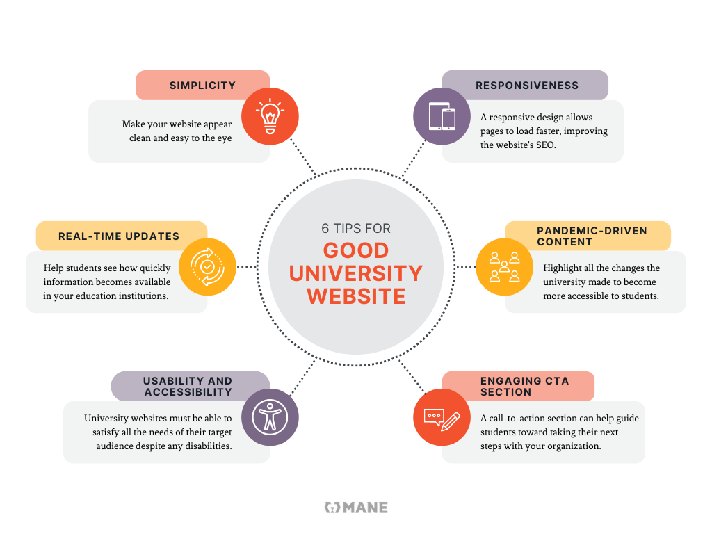
A simplistic design using just a few of your institutions can go a long way. It can make your website appear clean and easy to the eye, making it more likely for students to navigate it pleasantly.
2. Responsiveness
A responsive and easy-to-navigate design will mean that even those who visit your website for the first time can easily access the website content they need. By making the entirety of your university’s knowledge base quick to access, prospective students will think of your university as well organized.
A responsive design not only allows pages to load faster but also helps improve the SEO of your website.
3. Real-time updates
Real-time updates can be the key to turning campus life into a digital experience. A segment for real-time updates will help students see how quickly information becomes available in your higher education institutions.
Real-time updates can also help drive your Search engine optimization, as Google tends to prefer regularly updated websites. If you want to boost your content strategy and reach, you can also link real-time updates to your email marketing by encouraging students to sign up for newsletters to keep up with school.
All of these will drive up your college or university’s website traffic.
4. Pandemic-driven content
The pandemic really altered the space of higher education institutions as it made them focus on students’ digital experiences. A good higher ed web design should therefore highlight all the changes the college or university made to become more accessible to students during that time. While content creation regarding the pandemic might not always be fun, it can be extremely important as it will show the students the organization and administrative efficiency your university can provide through the knowledge base available on your website.

5. Improved usability and accessibility
University websites must be able to satisfy all the needs of their target audience. This means being easy to navigate and completely accessible. This is particularly important as showing students that they would be welcome to join campus life despite any disabilities, whether intellectual, physical, sensory or mental, can be the key to higher education institutions being chosen by prospective students as their new home for the coming years.
A good higher-ed web design will also help students access all the website content faster. Navigating the website can also reduce the number of times students need support from the university’s help center and administration.
6. Engaging CTA section
As hard as it can sometimes be for higher education institutions to accept this, university websites are essentially an education marketing campaign to bring more students through your door. A CTA Section, or call-to-action section, can help guide students toward taking their next steps with your organization. For example, by having them sign up for a newsletter, you can improve your email marketing and use the emails to remind them of upcoming application deadlines or innovations that will drive them in. This can be the key to further search engine optimization and getting more students to apply and join your institutions.
Applied website accessibility rules
In all web design, the applied accessibility rules include the following four and their best practices:
1. Perceivable
The knowledge base must be presented through a design that makes it easier for people to perceive them. This might mean providing text for visual imagery, captions to videos, and using other accessibility features.
2. Operable
The website should be able to be operated both normally and through the keyboard. The content should be easy to read, and users should be given enough time to navigate the page.
3. Understandable
The website should operate predictably and be easy to navigate by all users.
4. Robust
The content should be accessible through all assistive technologies and tools that users have available.
Predominate image
Your higher ed web design should be created in a way that is easy to read and directs the user to the website content you want them to pay attention to. To do so, you can use colors and visual cues that help the eye focus on specific parts of your website. This will help you make more impact on the user and will help drive up the google analytics to specific pages and content you think should be highlighted.
Conclusion
Customizing web design and development for higher education institutions can require much work. Therefore it is often best to use professional services to help guide you toward creating websites and content that pop out on the page and draw your target audience in. MANE Digital is a WordPress web development company with expertise in the website design for educational institutions. They can be your key ally in creating a website that follows all the best practices for drawing people in and helping your institution succeed in the digital space.


