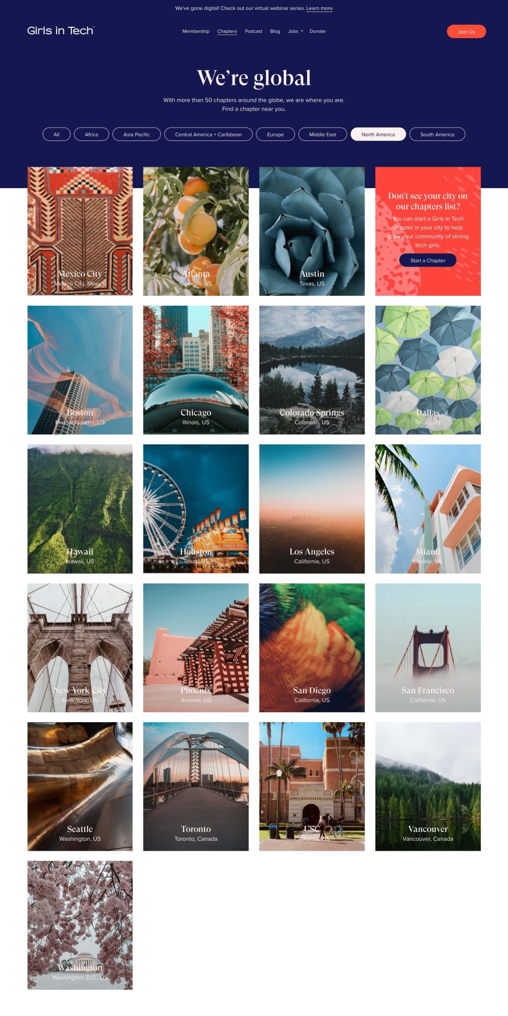
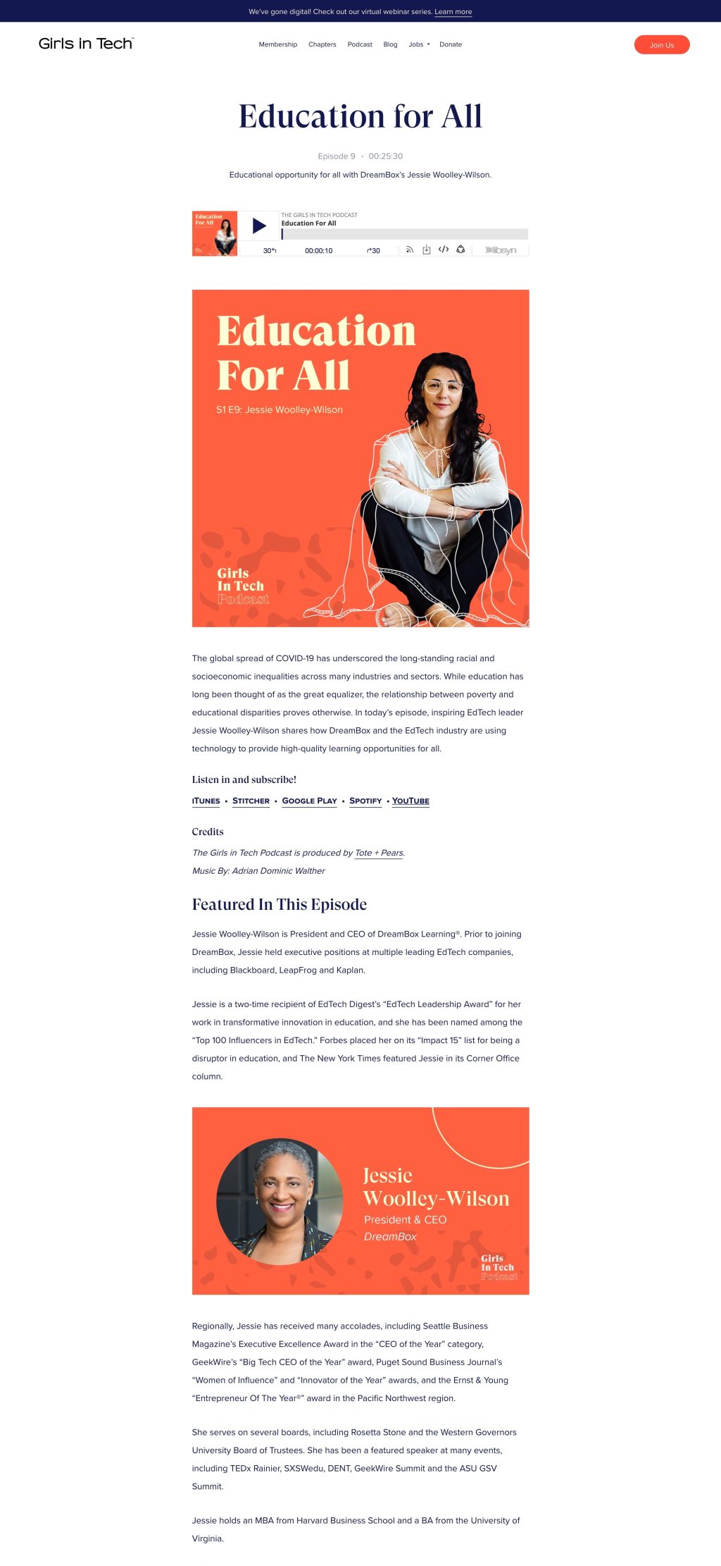
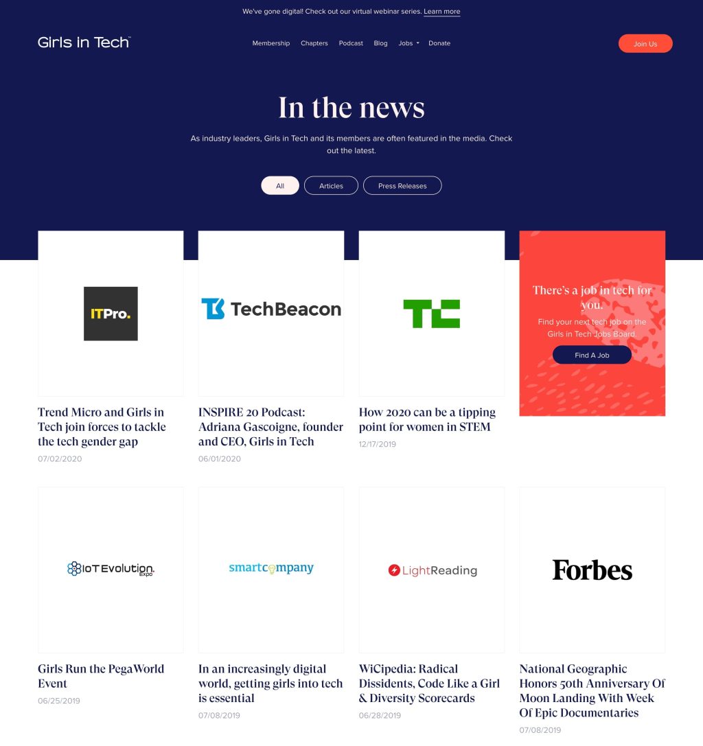
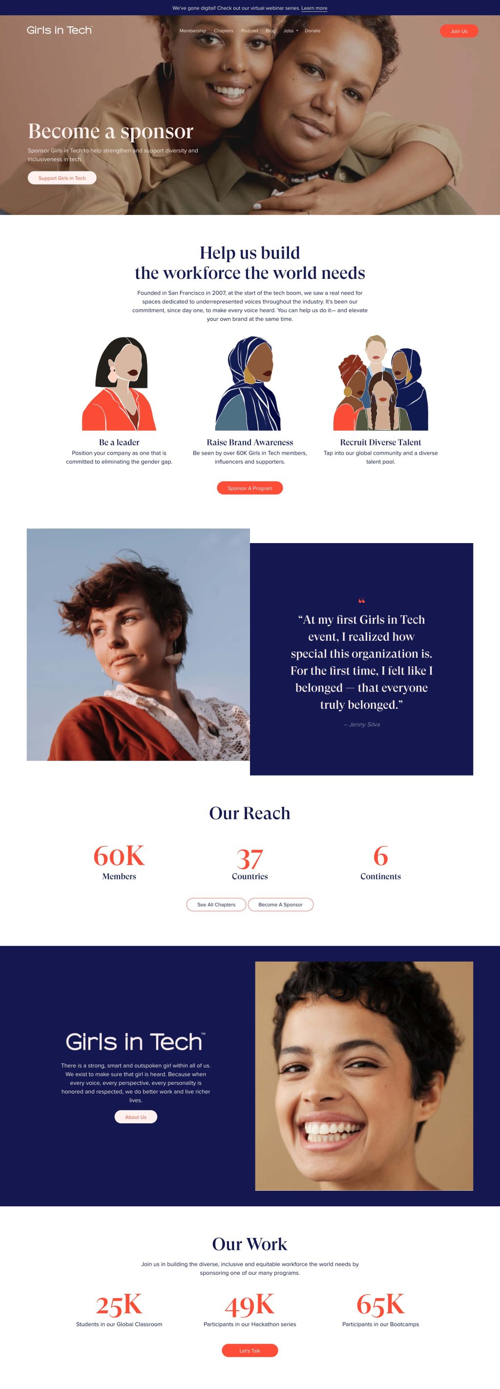
Finding a development partner isn’t easy. Lucky for us, we’ve found our team at MANE. Referred by a friend, Sasha and the group at MANE was everything we’d hoped for — reliable, strategic, and collaborative. They cared about our clients and easily integrated into our team. Often going above and beyond to make sure that the work that was delivered the team exceeded our expectations.
Case Study: Elevating Girls in Tech with Digital Solutions and Strategic Branding
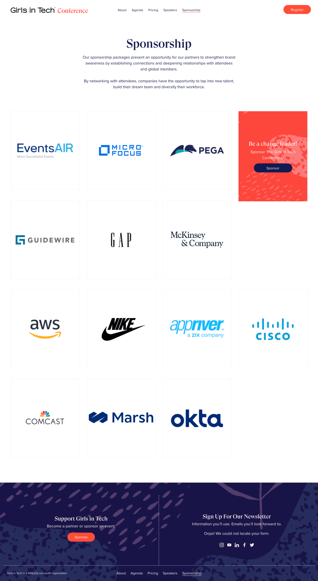
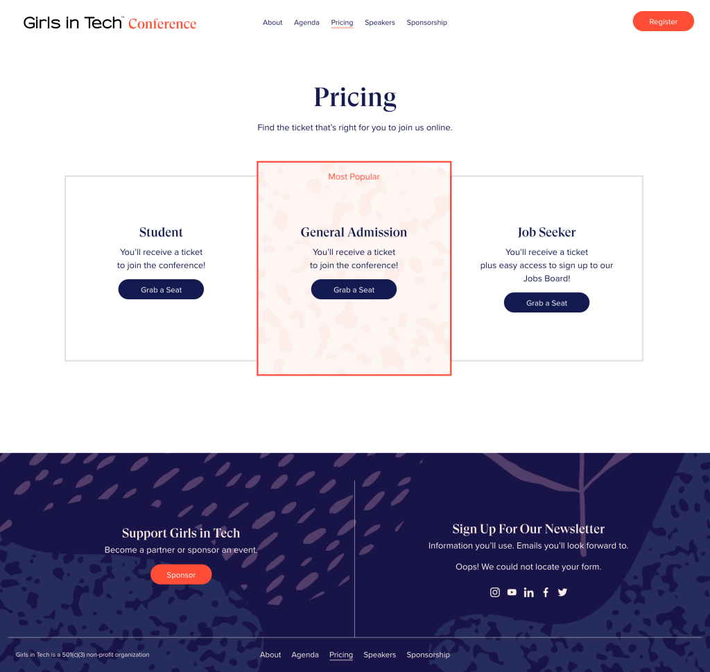
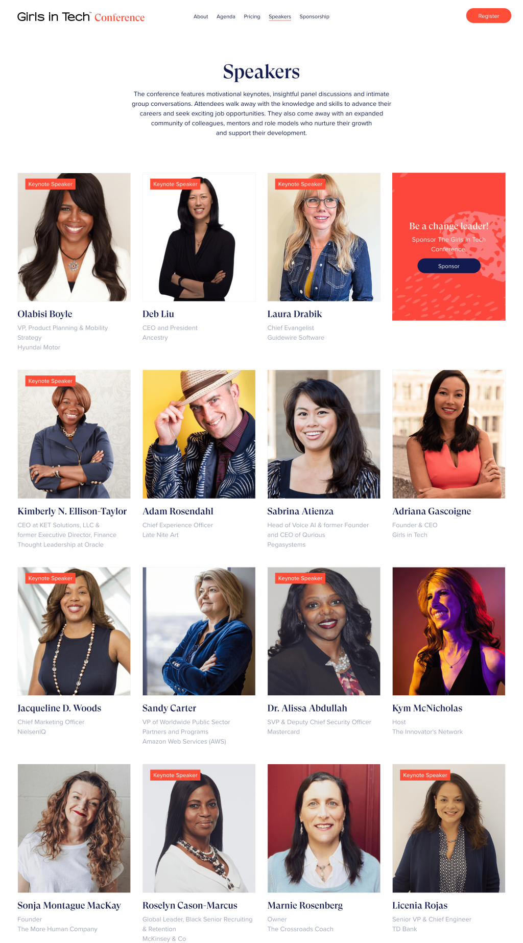
Girls in Tech, a global non-profit, struggled with inconsistent branding, poor website performance, and lack of ease in managing their multi-site network. In partnership with Women Branding Agency, Tote + Pears, we transformed their digital presence, delivering a unified brand experience, improving site performance, and streamlining operations. Our results saw a 600% increase in load speed and improved their technical SEO for 90%, significantly enhancing the Girls in Tech digital experience.
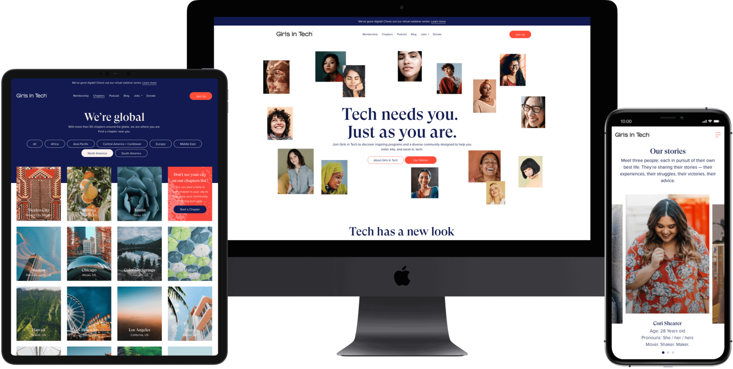

The Challenge
Our agency partner, Tote + Pears, is a creative studio specializing in creating resonating content, campaigns, and designs that tap into the nuances of women’s decision-making processes. They are experts in designing from a woman’s perspective. Invited by Tote + Pears to collaborate on a project, we got the chance to work with their client, Girls in Tech.
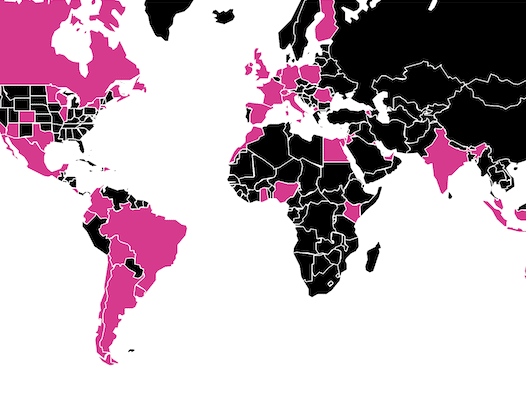
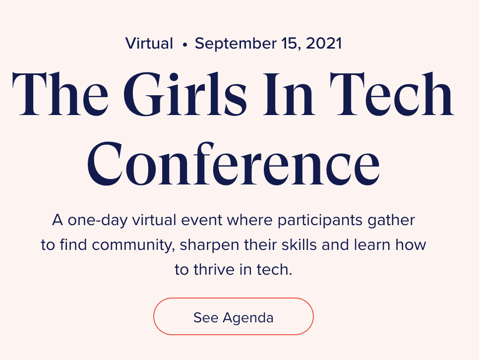
Girls in Tech is a non-profit organization founded in 2007 by Adriana Gascoigne. With over 60,000 members in 50+ chapters worldwide, Girls in Tech is dedicated to eliminating the gender gap in tech. They believe in tapping into every voice, perspective, and personality to create better work and richer lives.
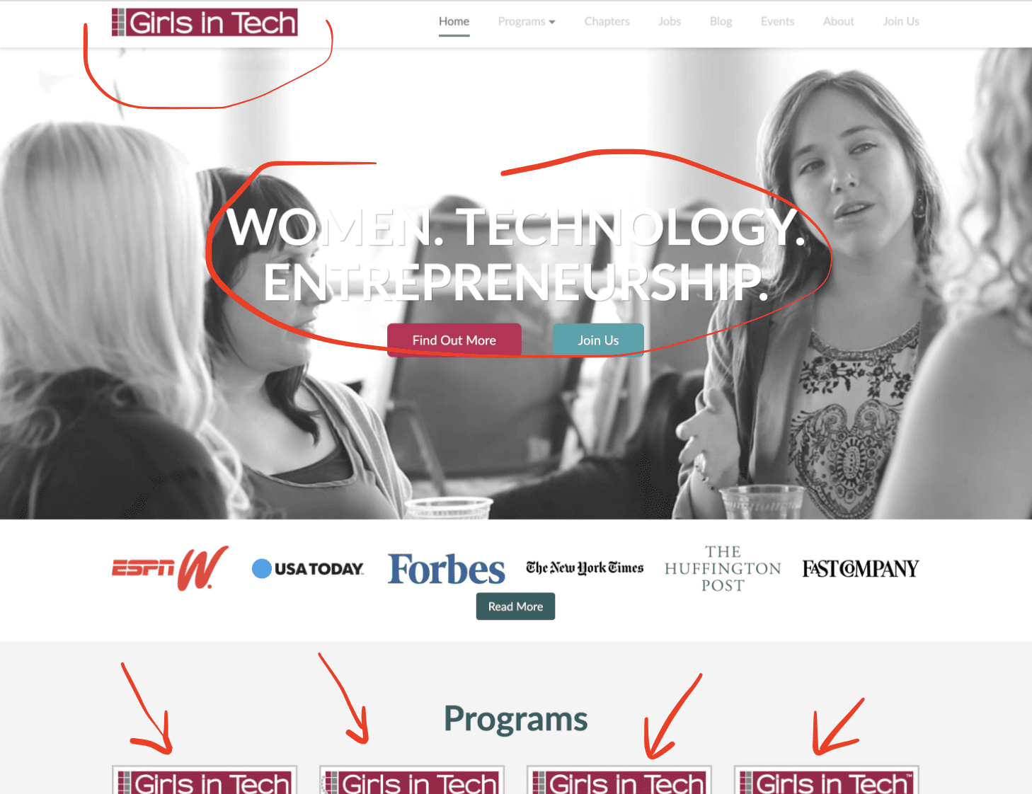
Visual Appeal
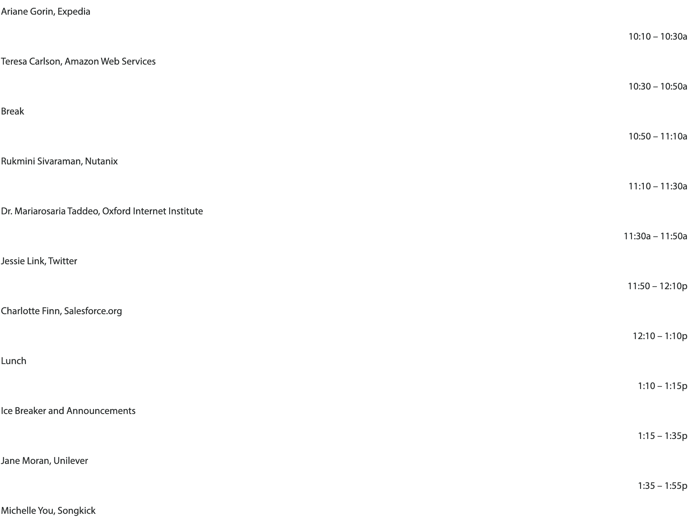
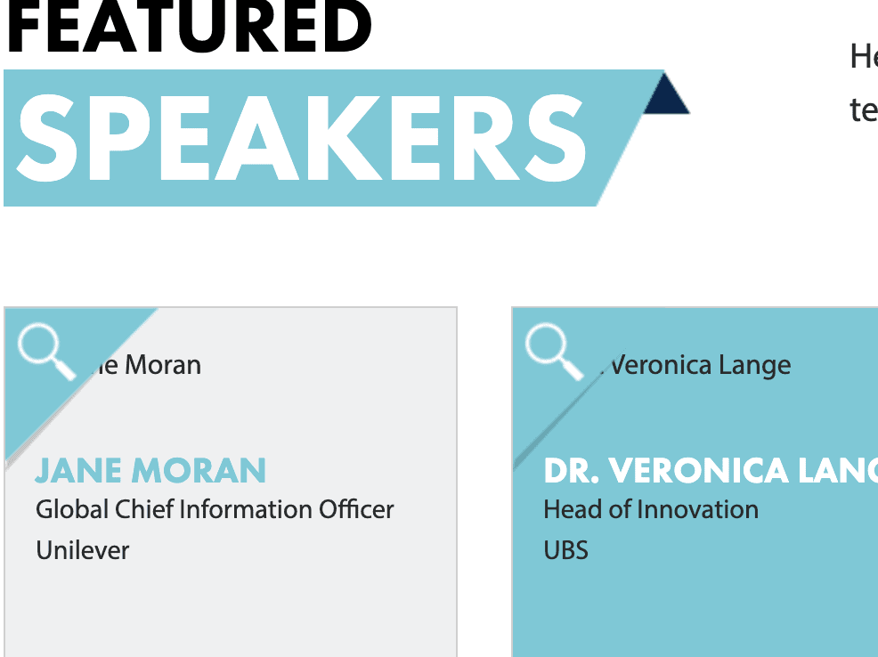
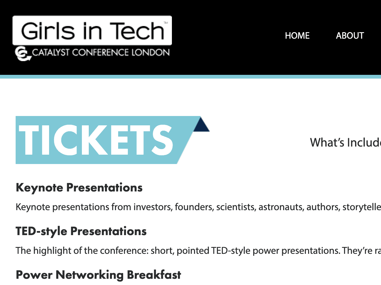
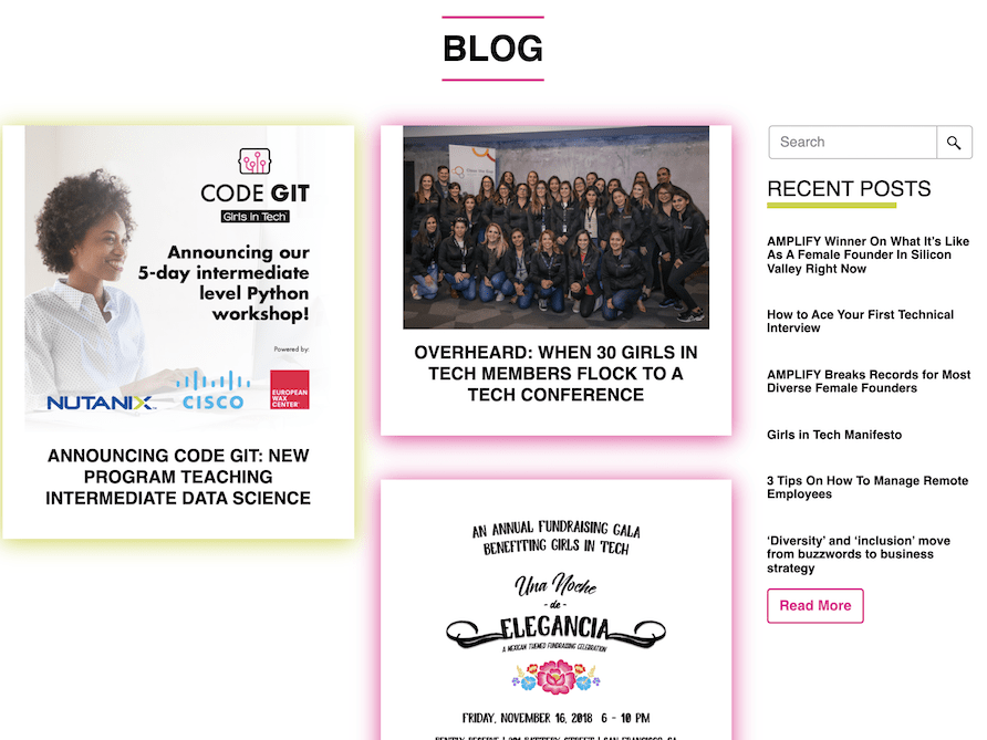
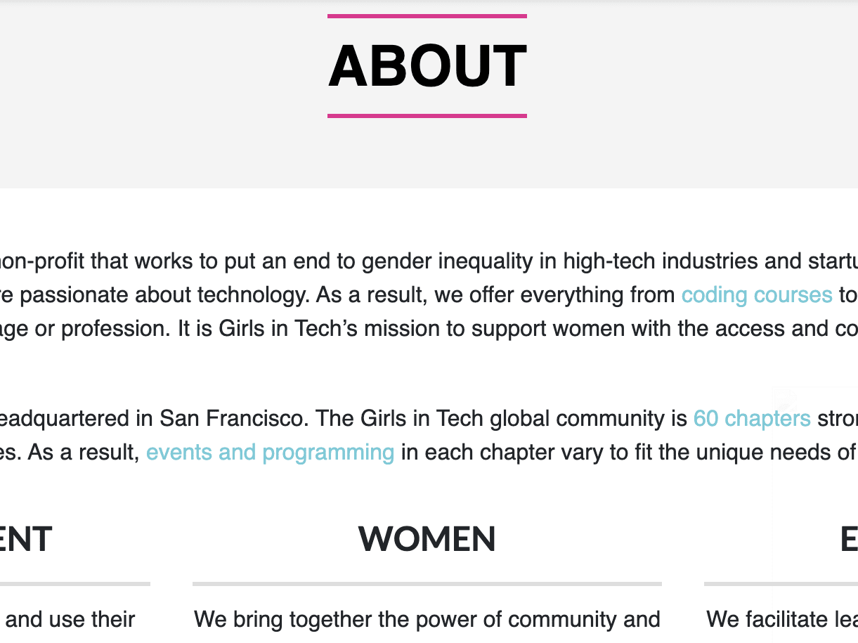
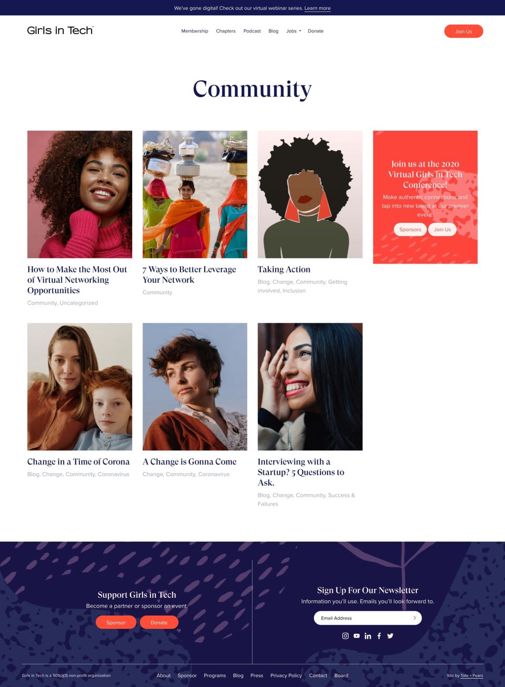
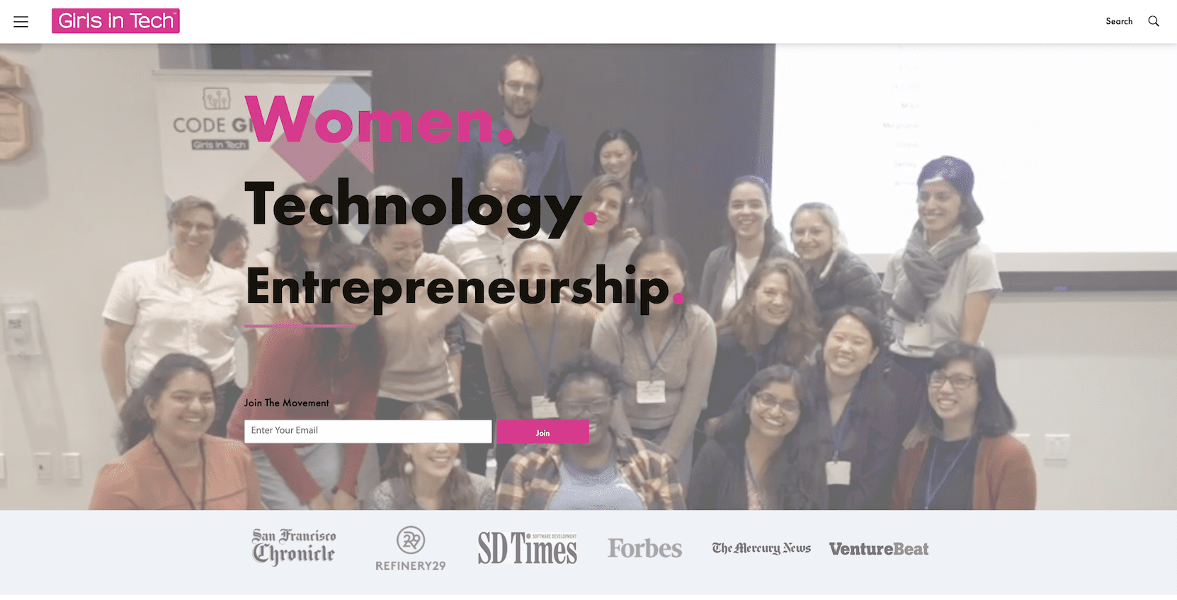
The branding was inconsistent, with no clear design language, lack of layout and content consistency, resulting in a disjointed user experience.
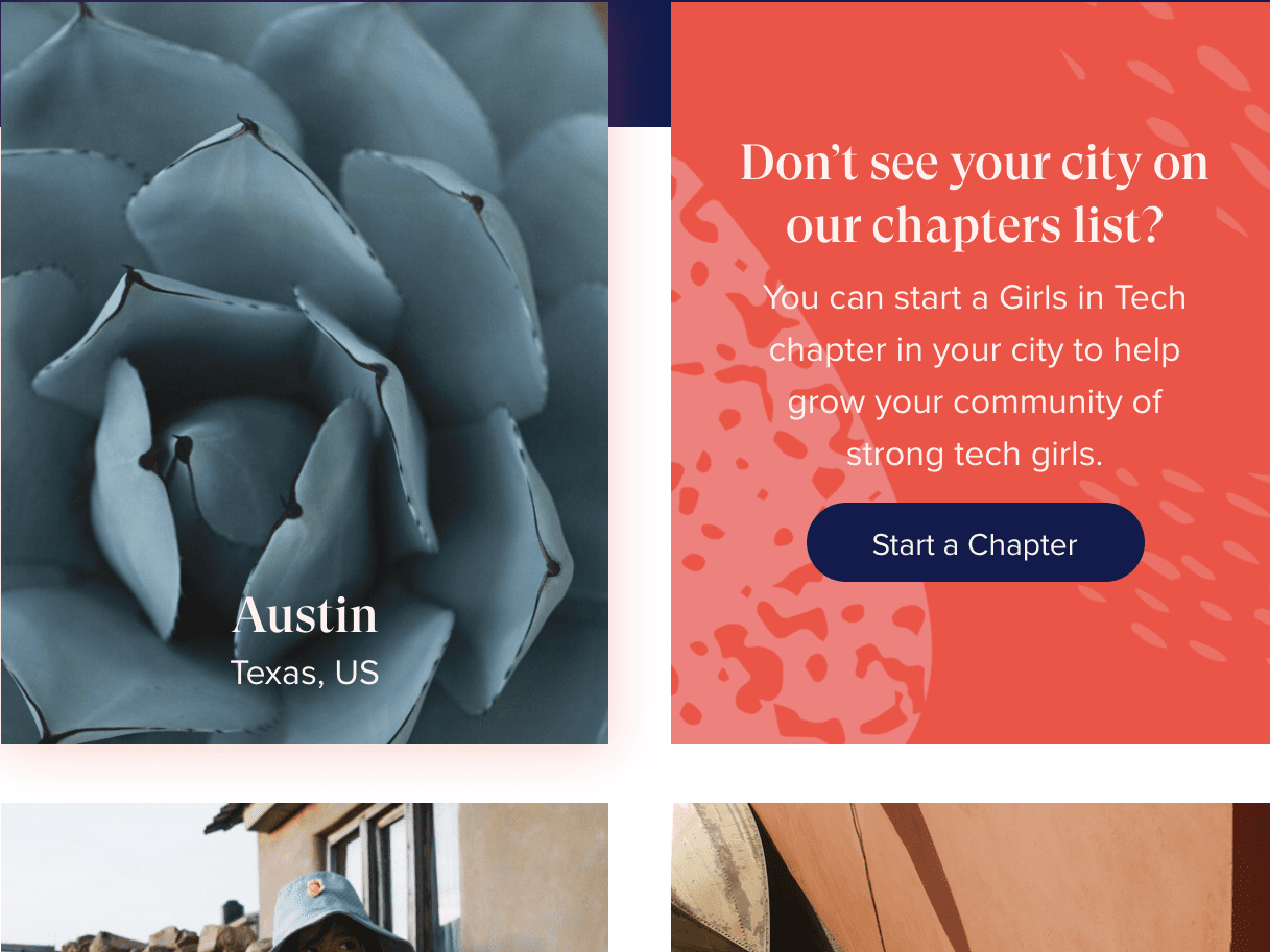
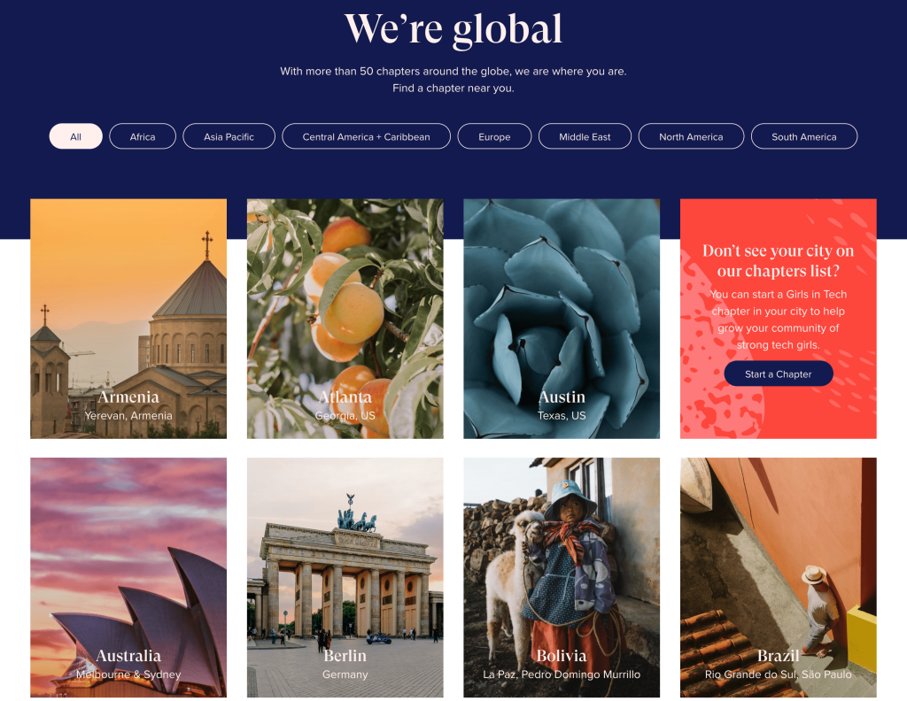
Across the subsites network, the problem was even more apparent.
Technical & Conversion Performance
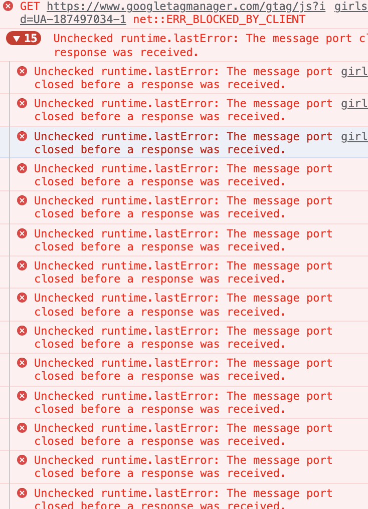
With a page load time of around 7 seconds, the technical performance of the site was below par. The lack of strategic calls to action and poor visual and technical performance led to suboptimal conversion rates. Several UX/UI and technical issues compounded the problem. The absence of images resulted in a disjointed user experience, while low readability and poor contrast on buttons hampered user interaction. Inconsistent line spacing disrupted readability, and a weak hosting infrastructure impacted the site's performance. Operational issues arose from console errors and a off-brand presentation caused inconsistencies with the brand's identity. Map maintenance challenges hindered usability, missing subsites led to outdated chapter lists, and unappealing blog visuals added to an outdated look. Finally, content redundancy resulted in inefficient information distribution.
Performance Grade
66
Page Size
4.1 MB
Load Time
7.86 sec
Requests
75
UX/UI and Technical Issues
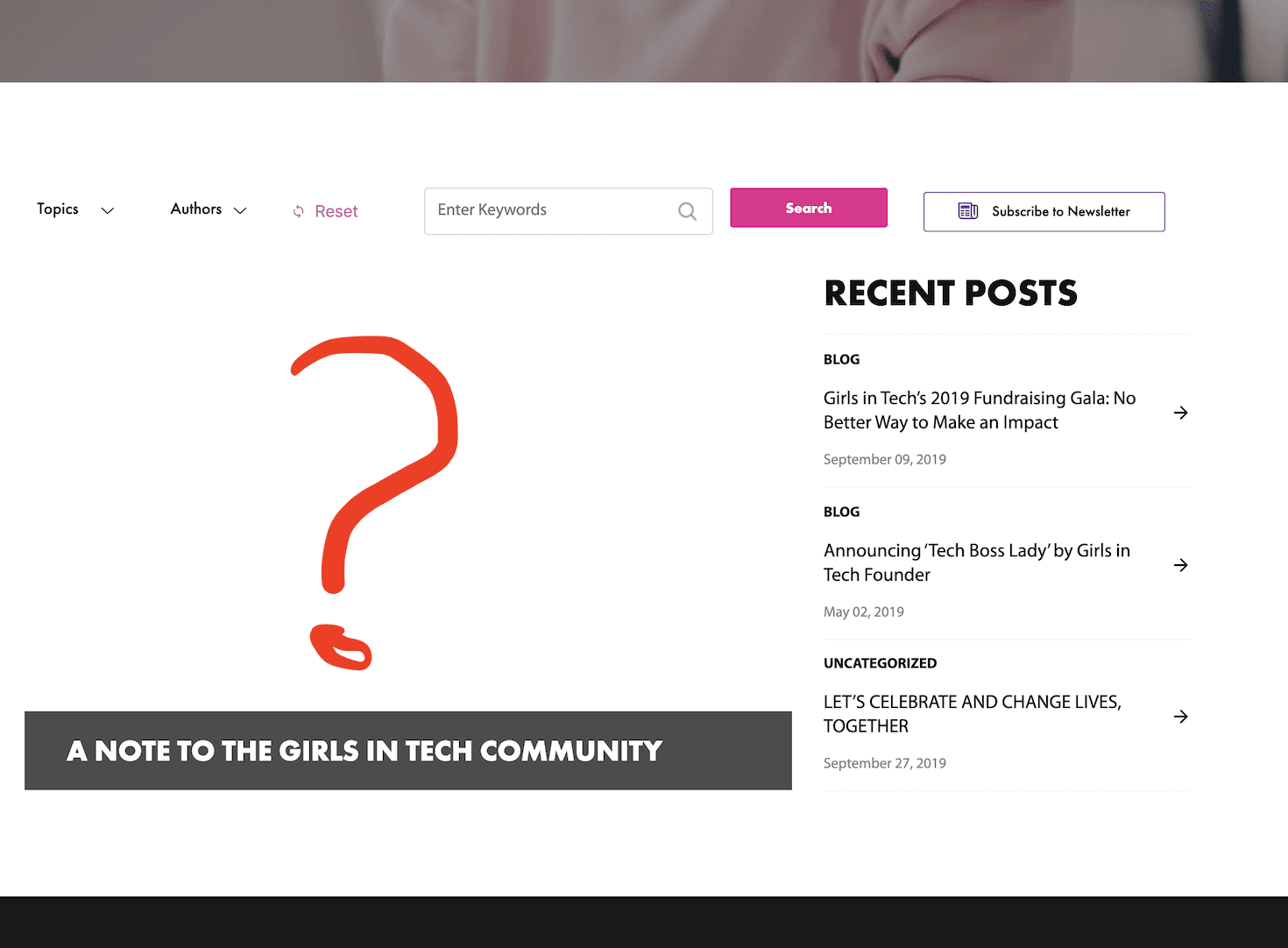
Missing Images
On some layouts we noticed missing images.
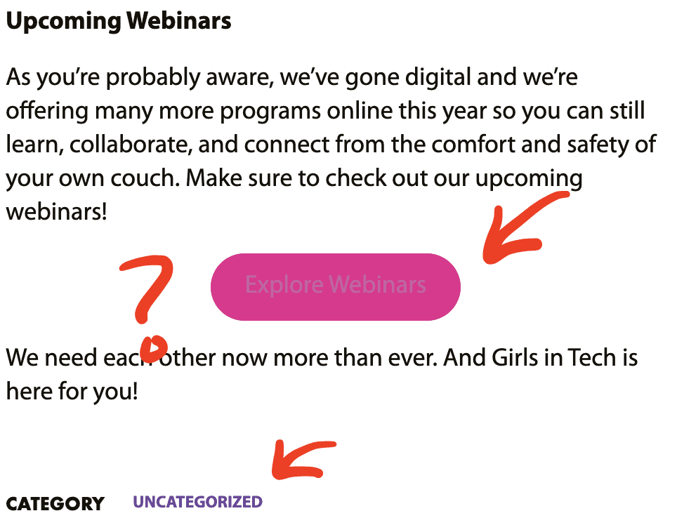
Readability and Categorization
Low contrast on buttons makes the text unreadable. Webinars using blogs for annuncements instead of specialized components.
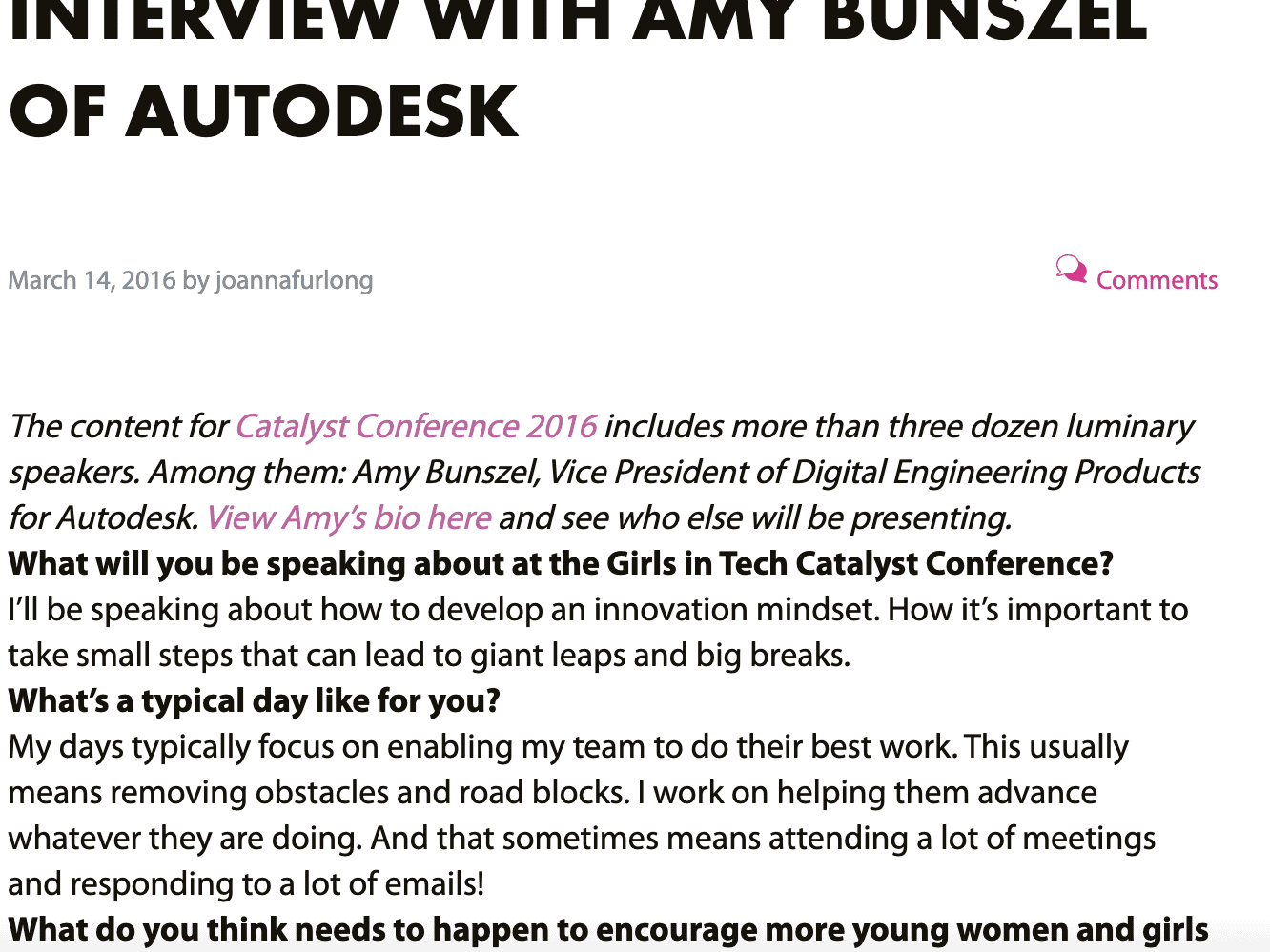
Line Spacing
Line spacing could be improved. In some places is too big, yet in others, it feels too condensed.
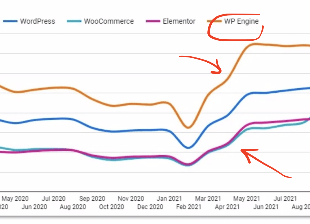
Hosting Infrastructure
The current hosting provider was affecting the performance through oversold infrastructure.
Identified Improvement Areas
- Maintaining uniform branding on the primary site and throughout the chapters (WordPress subsites).
- Endorsing WordPress as the best CMS for nonprofit organizations.
- Performance enhancements.
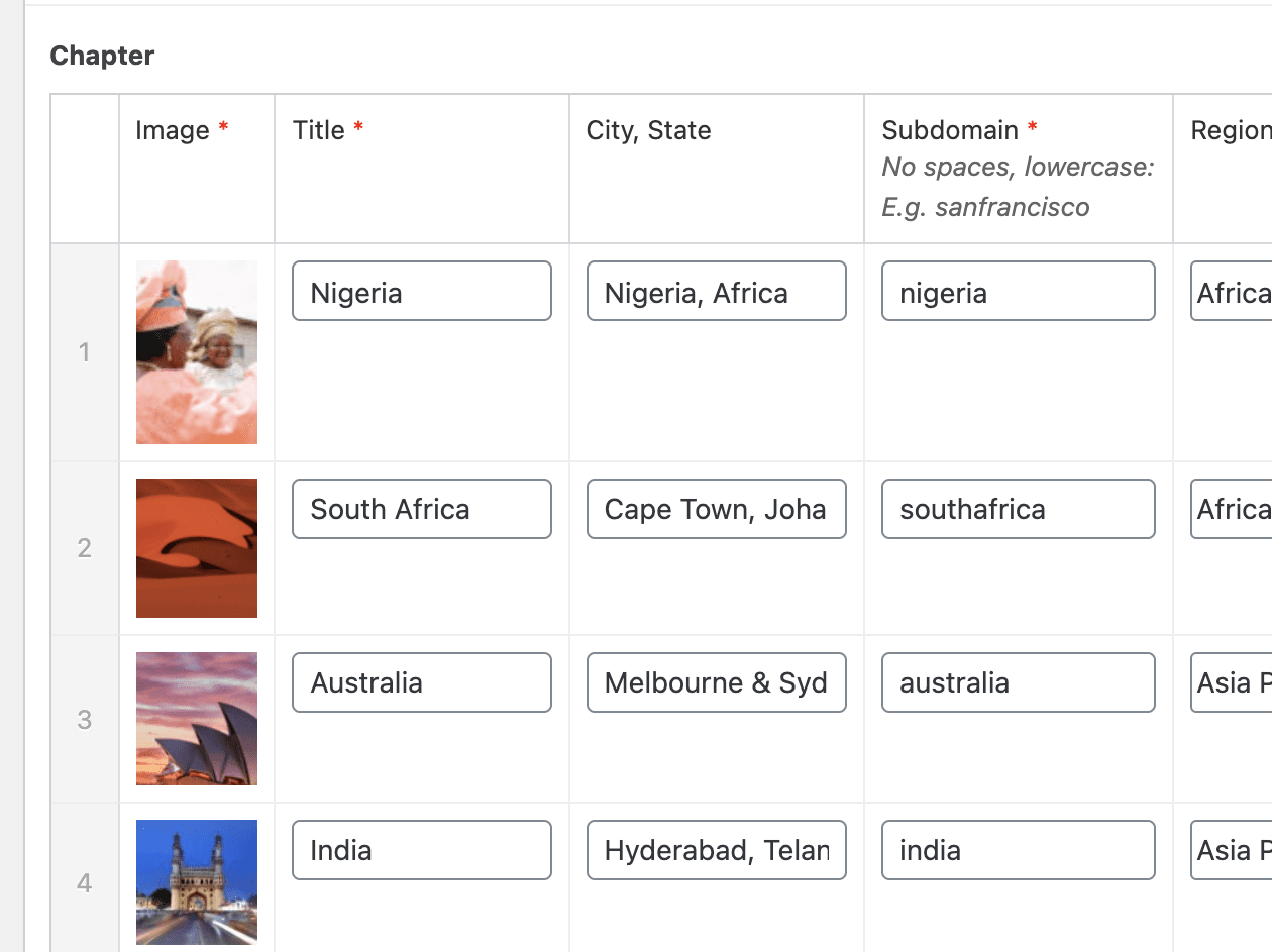
- Simplifying event planning by creating a suite of pre-defined components and pages.
- Facilitating the management of international chapters.
- Enabling centralized, yet elective content distribution throughout the WordPress network.
- Constructing versatile and brand-aligned Gutenberg components for universal usage.

The Solution
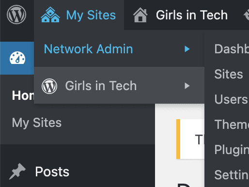
Our agency partner, the distinguished Women Branding Agency Tote + Pears, established exceptional branding solutions for Girls in Tech, effectively addressing all the noted challenges. This led to our strategic development of consistent and brand-aligned components and templates for WordPress on a Multisite architecture, significantly streamlining Girls in Tech’s network site management.
Our strategic methodology prioritized direct confrontation of the core challenges. Centralizing style, segregating content from design, and harnessing brand-aligned components became our focus. Additionally, we implemented content publishing functionalities to simplify managing the intricate chapter structure.
Key areas identified for enhancement included ensuring brand consistency, boosting performance, streamlining event planning, improving the management of international chapters, and creating reusable components aligned with the brand.
Some of the improvements we accomplished together
- Instituting uniform branding on the primary site and throughout the chapters (WordPress subsites).
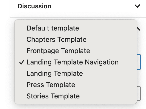
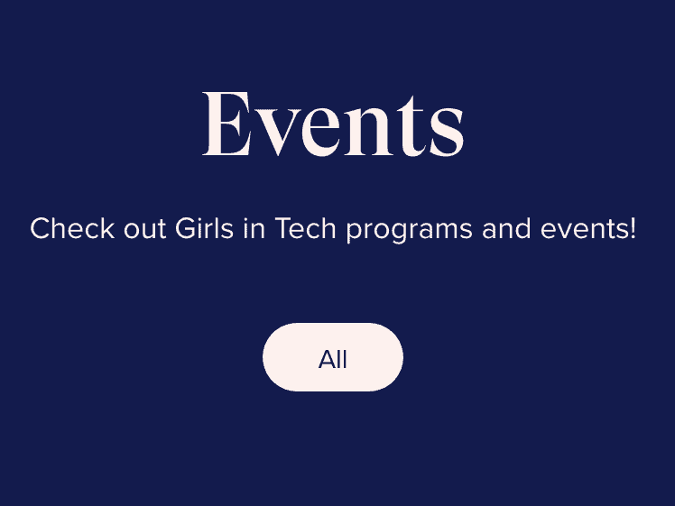
- Engineering a range of page templates and components specifically for Events, aiming to standardize procedures and layout.
- Formulated reusable and brand-consistent Gutenberg components applicable in diverse contexts.
- Furnished video training and recordings concerning the site infrastructure and components for their developer team.
- Developed reusable and on-brand Gutenberg components that can be used everywhere.
- Provided video training and recording for the site infrastructure and components for their developers.
Our Results on Delivery
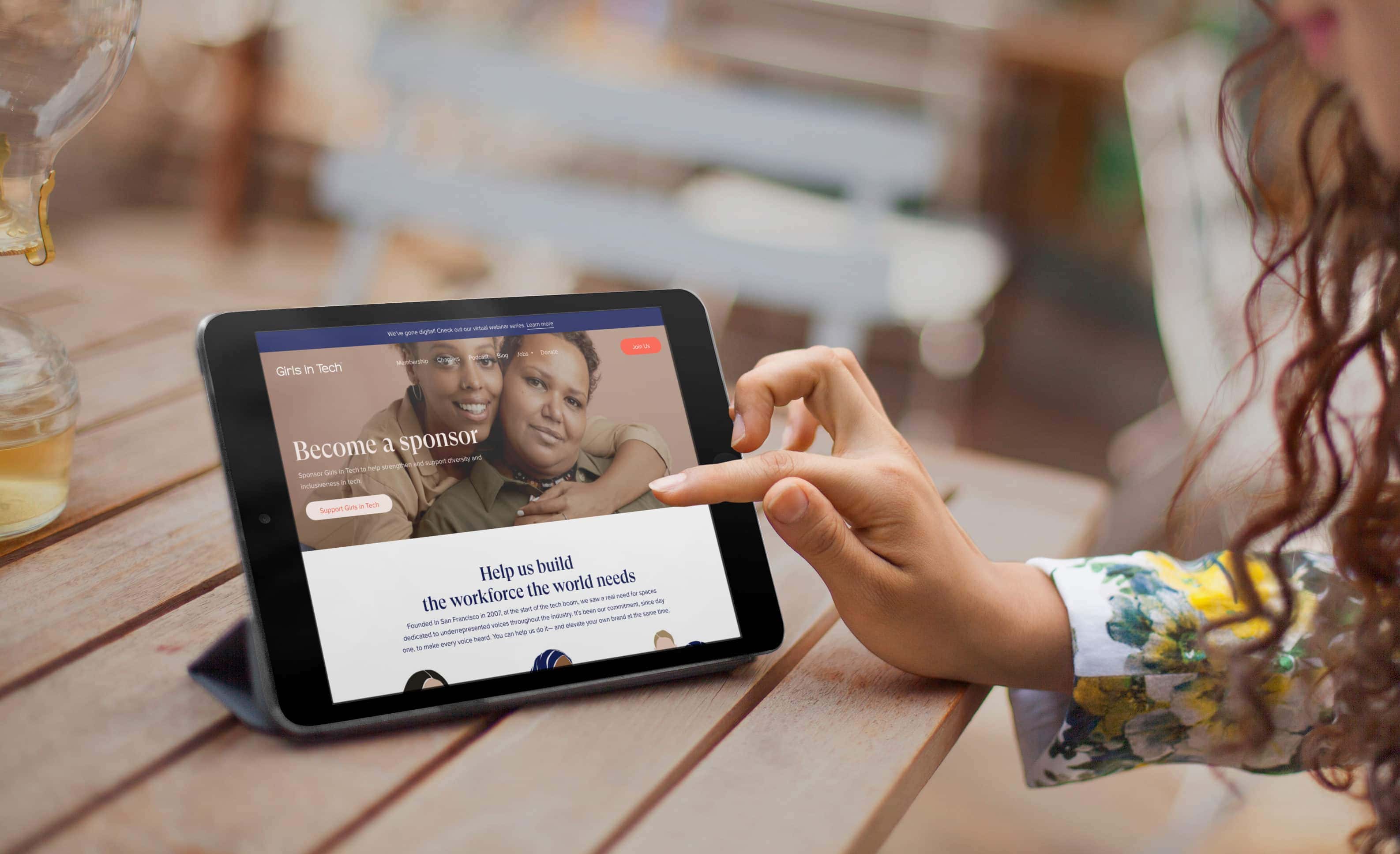
Beyond the implementation of the compelling branding developed by Tote + Pears, our solutions led to significant improvements:
600%
Page Load Speed Increase
We improved page load speed from 7+ seconds to just about 1 second.
40%
Overall Performance Increase
Our efforts resulted in a combined index of overall performance and technical user experience increase by 40%.
90%
Technical SEO Improved
Within the budget, we managed to improve of technical SEO over 90%.
50%
Page Size Reduced
We optimized the page sizes, reducing them by 50% without losing visible quality.
Other Improvements

Enhanced Chapter Administration
We have refined chapter management processes, including a streamlined system for launching new subsites.
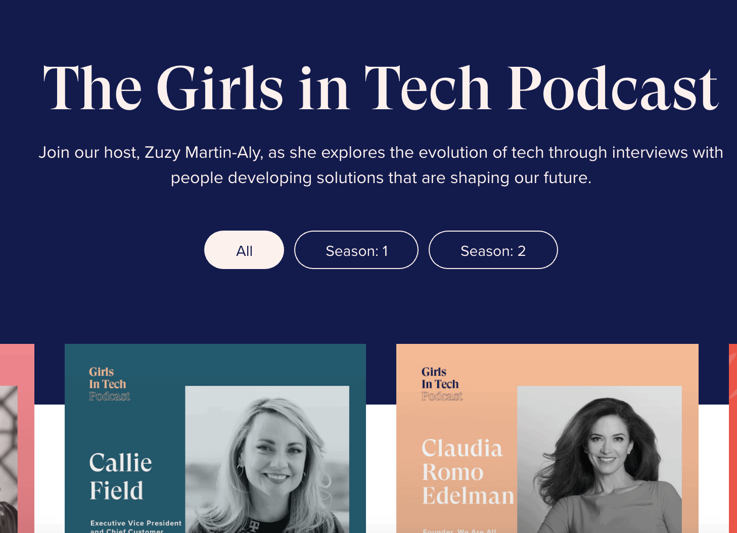
Introduction of Podcasts
The addition of the podcast format to the Girls in Tech website opens up new avenues for leadership opportunities.
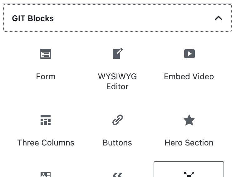
On-Brand Gutenberg Blocks
Our designed blocks are poised to maintain brand consistency, thereby minimizing errors in content editing.
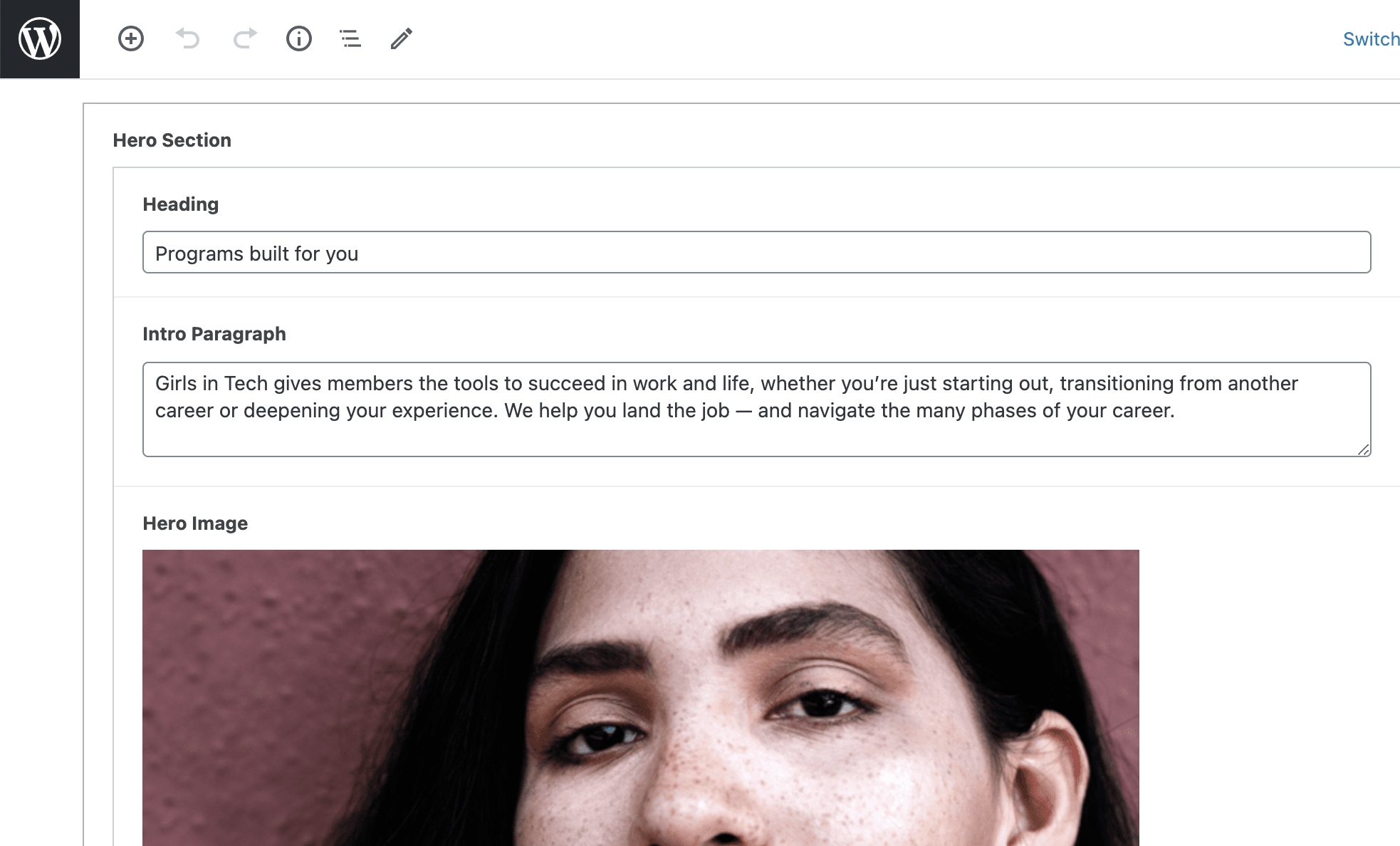
Design & Content Segregation
By leveraging Gutenberg blocks, we have successfully decoupled the design from the content, ensuring layout and branding consistency.
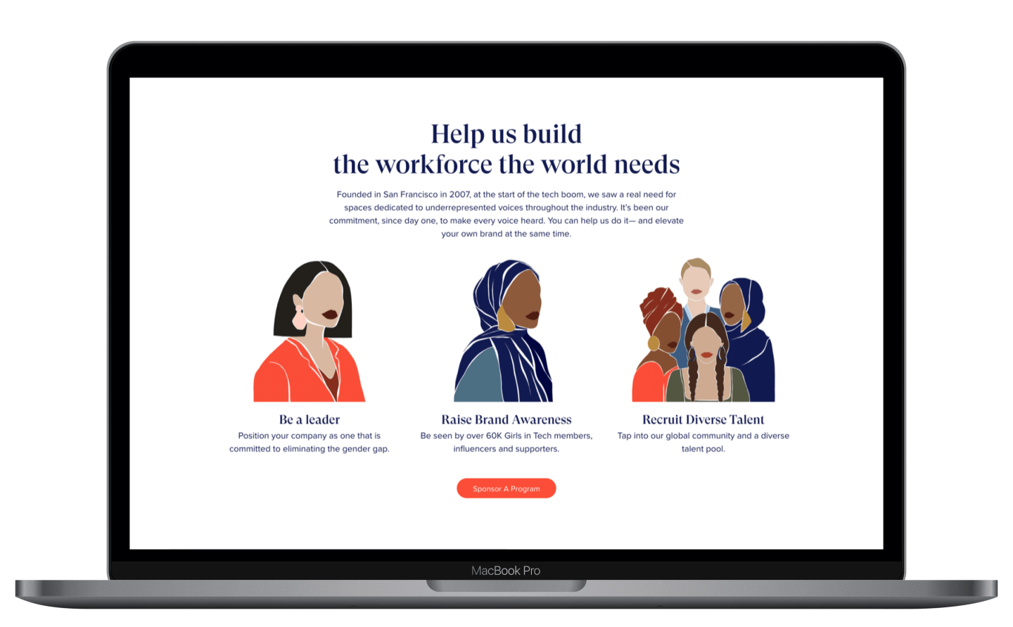
Summary of Services for Girls in Tech
Improvements
- Building Branded Components
- Creating New Content Channels
- Unifying the Layout
- Standardizing Processes
- Improving Technical SEO
- Separating Content from Design
Services
- Front-end Development
- Back-end Development
- HTML/CSS Coding
- Technical Consulting
- 3rd Party Software Integration
Technologies
- WordPress Multisite
- JavaScript
- Gutenberg
- Bootstrap
- Vue.js

Amber Anderson
Co-Founder
Conclusion
In conclusion, our collaboration with Tote + Pears resulted in a significant digital transformation for Girls in Tech. Our expertise in UX/UI design, website development, and SEO outsourcing services, combined with our commitment to data-driven strategies and mutual success, helped us deliver a solution that addressed the organization’s challenges and exceeded their expectations.
Want to experience a similar transformation or offer more to your clients as an agency? Contact MANE Digital today. We’re more than just a digital agency; we’re your partners in growth, ready to provide innovative, data-driven solutions that ensure your digital success.
Schedule Free Consultation